Friday, February 12, 2010

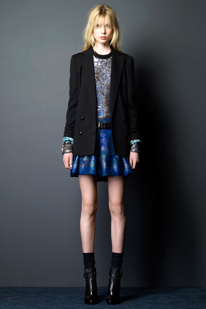
Favorite of the Day: Lyn Devon

Fashion Month began in earnest yesterday and with that beginning comes the return of my Favorite of the Day series.


I have a penchant for any collection that features only sweet flats.


Photos via

Friday, February 5, 2010

Back Issues: T, The New York Times Style Magazine, Spring 2008

Most of the magazines I find in random places throughout my mother's house are from several years ago. Since I could only transport a few back with me, issues from my time in New York are rare. So it was with some shock that I stumbled upon my Spring 2008 copy of T: The New York Times Style Magazine.


Mere weeks out from the Bear Stearns collapse and a spring and summer away from the eventual crumbling of large pieces of our economic system, there is something of the abandon of the earlier part of that first decade of this new century all over the magazine. In the clothes featured. In the lavish ads. Many, from Vera Wang to Bottega Veneta to Weatherproof, featured a second page with only the name of the brand. No product. Just letters floating in empty space. Elephants appeared prominently in both a Hermès ad with Lakshmi Menon and a fashion spread with Jessica Stam. Models leapt in Malandrino. Ralph Lauren commanded a four page spread at the front of the book. A short story shared the price per pound of a group of six dresses. The Roberto Cavalli, a mere wisp of a thing at 3.25 ounces, tipped the proverbial scale at $20,554 per pound. There was little talk of frugality, a topic that one will now find in every issue of every magazine.

But for all of its symbolism, this issue was saved only by my forgetfulness. I either bought the paper especially for this magazine while home on a trip or brought it along for New York to Boston bus reading before forgetting to place it in my bag before my return. To be honest, I probably wouldn't have kept it. Somewhat flimsier and less weighty than its counterparts, T's often lost their covers and with that found themselves out with the recycling.

Despite the fragility of the cover, upon rereading I found the weight one usually finds in the physicality of the magazine transferred to the writing. It supplied an element I often find lacking in its counterparts. Cathy Horyn took an in depth look at the inner workings of Comme des Garçons. Daphne Merkin compared heels that you wear and heels that you date without making me instantly think of the frivolity embodied by one Carrie Bradshaw.

Unlike the other issues in this series, where the reason for their rescue resulted from a long ago emotional reaction to images, this one was saved because of its words and its history.


Image via

Friday, January 29, 2010

And the Award Goes To

As we get closer and closer to the start of the Fall/Winter 2010 fashion month, more pre-Fall collections trickle in. While doing my usual reconnaissance, I stumbled upon two dresses in the Monique Lhuillier collection that need to be worn by somebody on Oscar night.


Especially the rose one.


Photos via

Tuesday, January 12, 2010

Addendum

Though Pre-Fall 2010 collections continued to trickle in after I wrote my two part roundup, nothing was presented that moved me in the same way as those original five collections.

That was until the Proenza Schouler presentation.


Yes, I would like my schoolgirl with a side of bed head and sequins.


Photos via

Sunday, January 10, 2010

Never Too Late

I finally bought a pair of oxfords.


It only took several months, a trip to New York and a stop at Topshop for me to bite the bullet.


Photo via

Thursday, January 7, 2010

A Tale of Five Collections: Part Two

The prints and patterns that were so heavily adopted in the Spring/Summer 2010 shows did not fade away with the passing of the seasons. Instead, they were offered by many in the colors of fall as a way to feel the whimsy of summer shortly after its passing.

Doo-Ri Chung has had a whirlwind five years. She moved from presentations to full-fledged runway shows. She received the CFDA/Vogue Fashion Fund award. She started a diffusion line. Yet with all of the expansion and praise, she has continued to grow and change artistically as well. Challenging herself anew every season. For Fall/Winter 2009, her line, Doo.Ri, offered interest in the form of heavily embellished tights. For Pre-Fall 2010, there are instead patterns in black, white, gray and deepest blue.


Zero + Maria Cornejo entered the public consciousness after being worn by First Lady Michelle Obama. It was a rather bold choice as Cornejo’s pieces don't fit into the rather limited spectrum of what most expect a First Lady to spend her time in. There are no skirt suits here. Just easy, modern pieces. Jumpsuits and dropped crotches. Patterns in dark colors infused with occasional shots of bright blue and green. Dresses that are classic because of their design, not because they recall a time long gone.


As I was first making my way through the Missoni collection, I got a bit of a headache. I clicked through the pictures too quickly. The patterns passed in front of my eyes in a blur. I realized that I wasn’t getting the larger picture, so I stopped and began again. The collection had some of the feel of the Peter Som Spring/Summer 2010 presentation altered with a hint of I like to spend time rummaging in my grandmother’s attic. I would get a little lost in these clothes, becoming all lumps and bumps, but for some, the beauty and intricacy would highlight as opposed to detract.


Photos via

Sunday, January 3, 2010

A Tale of Five Collections: Part One

I was going to tackle my summary of Pre-Fall 2010 much as I did the various city round-ups of Spring/Summer 2010. Highlighting trends. Pointing out designers you may not know. In my notebook there is a page with headings. Gray. Patterns. Suiting. Beneath each lay designer names. My handwriting begins to devolve at the end of the page. Letters run together. Words are crossed out, scribbled on, circled, and underlined. I looked at it all and decided to begin again.

Discussing the five collections I love proves to be the easiest way to tell the story. To touch on all of the themes continued from Spring/Summer 2010 as well as those that you'll see more of once the Fall/Winter 2010 shows start in about a month's time.

I'll begin with a rather familiar friend.

The SS2010 Burberry show was among my favorites of the season. And though the pastels and metallics were beautiful, my mind associates the brand with deep, rich colors and heartier fabrics. For Pre-Fall there is an abundance of gray, winter white, brown and black as well as a single shot of blood red. Impeccable tailoring with a hint of ease. And through it all, you will find the best handling of the military theme that is beginning to appear everywhere.


Jason Wu is also a consistent favorite here, but for Pre-Fall he revealed a side of himself that I have never seen. Darker. More womanly and less girly. Sexy. With tighter silhouettes, leather accents and higher hems. The palette is close to that of Burberry, and the military inspiration can be seen here and there, but these dresses are for a somewhat younger set.


However, this season it's a younger set on the verge of true adulthood.

To come will be the final three where you'll find the prints of spring featured in the colors of fall.


Photos via