Wednesday, September 14, 2011

Favorite of the Day: Rodarte

As a child, one my favorite books was a biography of Vincent Van Gogh written for the elementary school set. I loved looking at the beautiful paintings and learning about his life. But mostly I was enthralled by his particularities, especially when it came to the meticulous way in which he chose his paint. I was already a rather picky child. One who was always concerned about how things were organized. About my pencils and pens and markers and crayons. About my books and my homework. It was a revelation to my little girl self that someone so obsessed with order could also let themselves be taken over by such waves of creativity.

All of that little girl awe came rushing back as I viewed the pictures from the Rodarte show.


And I wondered where in my mother's house that book might still be living.


Photos via

Tuesday, September 13, 2011

Favorite of the Day: Zero + Maria Cornejo

It takes a sure and steady hand to present a show that acknowledges the feeling of the moment while also speaking to the particular vision of the designer. To go too far in one direction can leave one with the impression that a certain line is only capable of playing a game of Follow the Leader. To go too far in the other direction can make a collection seem out of step and out of place.

In my opinion, Maria Cornejo has always been one of the best at walking that line. Her silhouettes always feel fresh and new. Her prints exhibit a use of technology that others shy away from.


But she also allowed the colors that have been all over various runways their moment.


Photos via

Favorite of the Day: Diane von Furstenberg

It wasn't until the 11th that I was finally shaken free of my contrary mood. Here and there, most notably at Peter Som, I had liked the candy hues and florals that have dominated the runways of New York this season. But it wasn't until the Diane von Furstenberg show that I let myself be taken in by them. Maybe it was the way that she made the colors pop by pairing them with neutrals in the brown and beige family. Or it could have been the mix of shapes that went from slouchy and menswear-inspired to 60s mod to slinky and sultry.


Or it could simply be that even with all of those disparate influences everything still felt as if it were part of one story.


Photos via

Favorite of the Day: Band of Outsiders

Most events are said to come in threes. Deaths. Births. Trends on the runway. So it should be no surprise that in my third favorite from the New York Spring/Summer 2012 shows, I continue to ignore the prevailing winds. It won't last for long. I won't continue to be quite so contrary and quite so stubborn as I play catch up on my favorites. But the Band of Outsiders show on September 10th gave me a reason to stay on that path for a bit longer.


After wearing sundresses and lightweight sweaters and various pairs of shorts for the past few months, the idea of spending next summer in clothes that so deftly mixed a frothy femininity and a restrained masculinity excited me.

Because they would allow me to be this and that all at once.


Photos via

Friday, September 9, 2011

Favorite of the Day: TSE

After only two days, the trends of the new season are beginning to crystallize. I, however, continue to find myself drawn to pieces with more of a timeless quality. The stripped down. The pulled back. And, of course, the striped.

Waiting for its new creative director to take his place, TSE finds itself in a moment of flux. Oftentimes those periods can lead to a collection with no clear voice or direction.


But the well-curated collection shown yesterday betrayed none of that uncertainty.


Photos via

Thursday, September 8, 2011

Favorite of the Day: Jenni Kayne

When you dig deep, the roots of my closet can be found in a life lived on the east coast. Summer is all sun dresses and maritime stripes. Winter is all blazers and more maritime stripes. I often appear to be on my way to some type of boating event that will probably include copious amounts of gin and horrible jokes about Brown not being a real Ivy League university.

But there are times when I crave the clean, easy style one can find on the west coast. Jenni Kayne has been producing just those types of clothes for years. This season she mixed heather grays, crisp whites, muted creams and candy brights in combinations that were structured and loose all at once.


These were clothes for days that melt into each other. For seemingly endless sunshine and soft, sweet breezes.


Photos via

Thursday, August 25, 2011

Color Wheel

Despite what the subsequent heatwave might have wanted me to believe, I’ve felt the end of summer looming since the 4th of July. And with its end, the trends for fall have settled into many, if not all, stores. Most trends don’t need too many instructions. So leopard is popular. Do you want it in a shoe? A scarf? A bag? A pair of high-waisted pants? The choice of how much or how little or none at all is yours. But some trends present more of a slippery slope.

The ease of composing multi-piece outfits out of items in bold, solid colors fades away as one gets older. A quick walk through a playground, or a trip through an old photo album, reveals how easy it is for children to do just that. There is a carefree nature to dressing at that age, as there should be when your bright yellow pants will probably end up covered in dirt or chocolate or finger paint or fruit juice by the end of the day, and every color seems to go well with every other color.

But with age comes the urge to "tone down" bright colors with something in the neutral family, like a black, a white, a gray, or a navy, overtakes us. The easiest way to move away from that impulse is to include one piece that does the colorblocking for you and to add on from there with items like a brightly hued pair of tights or a vibrant shoe.

Ailanto


Joseph


Isabel Marant Etoile


A.L.C.


The other option is to chose pieces in those shades you sometimes shy away from and style your outfit accordingly. That path can lead to more creativity and more excitement but also more mistakes, so it's best to start with one piece and build from there. In this case, I chose a pair of bright blue jeans by J Brand.

From there, it's easiest to begin with colors that live a good deal away from blue on the color wheel. Mustard yellow reappears every autumn and is a perfect complement to the candy color of the jeans.

Especially when it comes in a swing sweater from H&M.


And is finished with tiger print stilettos by Isabel Marant.


A cool, berry tone, much like the one this slouchy Rogan sweater is found in, is the perfect antidote for those whom find yellow to be rather unkind.


A pair of short Frye boots give the look a relaxed, weekend feel.


But for most, it’s not complementary colors that cause problems but playing with colors in the same family that presents difficulties. There’s the possibility that you’ll choose shades that are so similar that you’ll look like one definitive stroke of paint. On the other hand if the shades are just off, you’ll seem hopelessly mismatched.

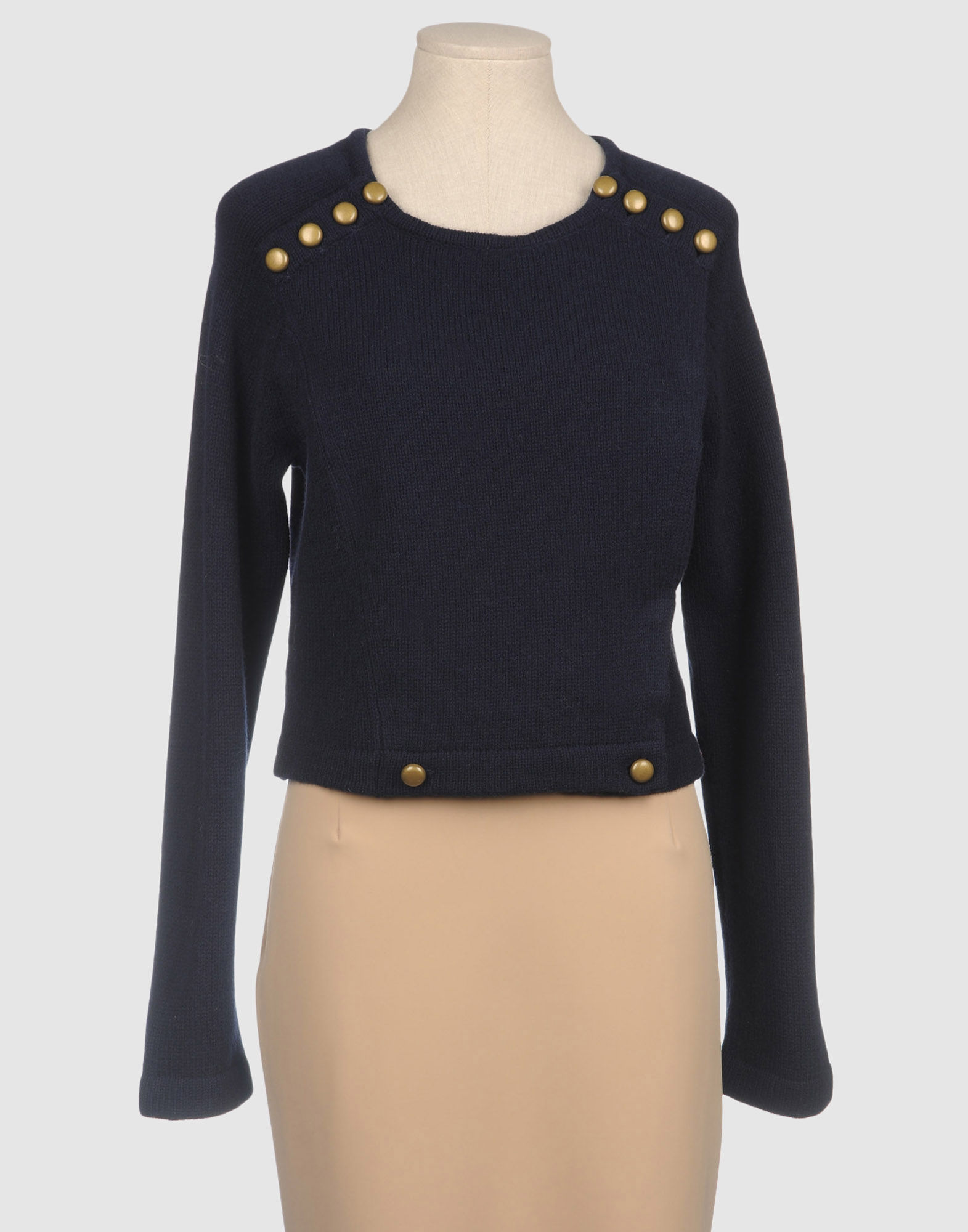
However, a deep navy, like in this sweater from Marc by Marc Jacobs, will simply dampen the shocking nature of the jeans.


And bright green loafers by Topshop will add an additional pop that breaks up the blocks of blue.


In the end, all of that color and all of that playfulness will act as a shield as the long nights and short days of winter approach.


Images via, via, via, via, via, via, via