Friday, July 26, 2013

Resort 2014: Roksanda Ilincic

The Roksanda Ilincic girl is as cool and bold as the hues that dominate this Resort 2014 collection. Unlike the colorblocking at Maxime Simoëns and Prabal Gurung, this collection deals almost exclusively in the varying hues of one color. It takes blue, a color often considered safe and boring, and adds an element of edginess by using fabrics of different finishes. Some swaths are full of shine. Some glitter. Others absorb all light.

The florals of this collection are more simplistic in nature, as if a child has taken a pair of scissors to a folded piece of construction paper and made a somewhat wonky chain of flowers or has begun absentmindedly doodling in the margins of a notebook. But that simplicity is offset by silhouettes that don't rest in the middle ground. They are either overblown and oversized or snug and sleek.


Like the blues seen throughout, there is nothing safe about them.


Photos via

Thursday, July 25, 2013

Resort 2014: Reed Krakoff

The group of brands making quality American sportswear is small yet their visions are expansive. It includes everything from the super luxe world of Michael Kors to the east coast preppiness of Tommy Hilfiger. Reed Krakoff has quickly elbowed its way into the conversation. Part of the speed of its entrance into the middle of things can be attributed to the infrastructure that the brand possessed from its inception. But even the most efficient organizational machine would count for nothing if the clothes weren't able to draw people in.

The clothes at Reed Krakoff are often about simplicity with a chic edge. Everything is about subtlety, a subtlety that cannot be upset by the use of supple leathers or overblown, half-finished floral prints. This collection is as seasonless as that seen at Band of Outsiders, but there is also a timeless edge that weaves its way through the clothing.


From the sweatshirt-like tops in perforated leather and snakeskin prints to the soft yet sculptural shapes of the dresses, these are clothes unattached from time in only the best way.


Photos via

Wednesday, July 24, 2013

Resort 2014: Prabal Gurung

Prabal Gurung has never been known for a trademark. This is not a bad thing. For some brands and their designers, like Mary Katrantzou, such focus opens the door to experimentation. For others the concept that every season presents a blank slate upon which anything can happen is what releases that magic. Prabal Gurung has dressed everyone from the current First Lady to starlets. He has presented collections centered around everything from Miss Havisham to the military. And it is that variety and flexibility that makes his work what it is.

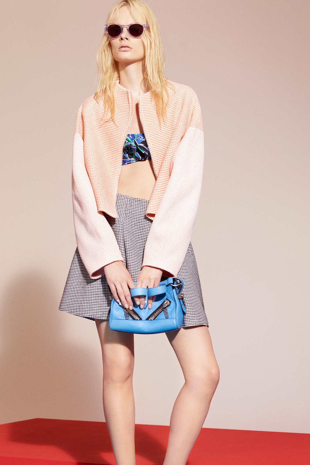
Of all of the Resort collections that I’ve discussed so far, this is the one that I’ve had the hardest time forming into something manageable. I want to include everything. Every jacket. Every suit. Every dress. Florals and colorblocking and prints play can be found in almost every garment but none of it feels overwhelming. It simply makes sense together in a way that you can’t pinpoint.


Many of the silhouettes recall the sporty influences of several seasons ago. The colors tend towards the primary but the carefree, almost childlike, feel that often leaks through when designers rely on that palette is missing. There is something else going on in this story. Something slightly off.

It only added to the allure of the clothing.


Photos via

Tuesday, July 23, 2013

Resort 2014: Maxime Simoëns

A few years ago colorblocking dominated the runways of all of the major cities, but after awhile its continued presence made discussing it boring. How many ways can you talk about the same trend before you have to start making up nonsense words? I made it about three seasons before giving up the fight. More recently colorblocking has hovered in the background, present but overshadowed by other stories. I expected things to stay that way, so it was something of a surprise to see it come back to life with such ferocity this Resort season.

At Maxime Simoëns the color choice pushed the trend out of the doldrums that it had come to reside in. You can rarely do wrong when playing with black and white and red but such strong hues might lead some designers to rest on their laurels, to allow the colors to do most of the work for you. But that is not the case here. The strength of the palette is only amplified by the ways in which the colors are combined.


And by the sensuality of the clothing.


Photos via

Monday, July 22, 2013

Resort 2014: Mary Katrantzou

Mary Katrantzou collections are known for vivid, photo-realistic prints presented on innovative shapes. Being known for something can force a designer into a corner. Customers and critics are both wary of any move away from what they’ve come to expect, but they are also quick to complain when they believe the clothes have become stagnant and stale. But this isn't a problem at Mary Katrantzou where the focused vision never hinders experimentation.

The prints for Resort move beyond the mere florals that appear elsewhere. Instead there are natural landscapes that are almost psychedelic in color. These are fantastical lands that one wants to jump into like the protagonist in a children’s film. Seen on dresses with silhouettes that recall the 1950s as well as more modern shapes, these prints can stand alone but instead they are contrasted with and complimented by features from a different type of landscape, that of a modern, almost futuristic city.


And with that combination, the collection becomes about taking things one step further.


Photos via

Friday, July 19, 2013

Resort 2014: Marni

The clothes of the Marni resort 2014 collection are decidedly dark in color and tone. They fit more closely with the name that more and more people are adopting for this season, pre-Spring. The Marni woman appears to have much on her agenda. And yes, as much as the three previous collections were meant for a certain girl, the clothes from Marni bring to mind a particular woman. How you tell one apart from the other is difficult to explain. It springs mostly from a feeling.

The prints are still full of flora and fauna but they lack the playfulness seen before. These are power florals in muted yet rich hues. That power leaks out from the prints and encompasses the silhouettes as well. The shapes will overwhelm all but the right people. Slightly overblown, almost stoic in nature, they give the hint that they are covering up a sweet softness that can be revealed only by touch.


They play both sides of the coin.


Photos via

Thursday, July 18, 2013

Resort 2014: Kenzo

There can be no question about the types of temperatures in which the Kenzo girl is spending her time. Hot. Balmy. Bordering on the oppressive. Days much like today. But unlike the resort collections of the past, as well as those from the storied fashion houses of the present, it isn’t because she is jetting off to an extended stay at her family's estate in Tunisia. She is not the moneyed girl escaping the dreariness of winter while wearing glorious caftans and oversized straw hats. Heat is a part of her daily life and year round she dresses accordingly.

She favors strong, jarring color combinations. Colors so bright that one almost has to shade one’s eyes when looking directly at them. The palm trees seen in the Fausto Puglisi collection appear again but in a more painterly and less photo-realistic manner. Her ensembles are not meant for the slow pace of vacation life.


And in her life, there is always some room to show a little skin.


Photos via

Wednesday, July 17, 2013

Resort 2014: Fausto Puglisi

In the Fausto Puglisi collection, some of the trends of the Resort 2014 season begin to show themselves. Oversized and vibrant prints dominated by flora and fauna and a reemergence of the colorblocking that was so prominent a few years ago greatly affect the tenor of the clothing. The ways in which the collection plays with those themes displays a confidence not often seen in a brand so young. Even when it veers off into the pastel, there is a brashness to the color palette that is only amplified by the fabric choices. That brashness continues to play out in the way that the oversized palm tree print fights with the more staid geometric patterns, a fight whose victor is the girl who chooses to wear them together. The collection moves easily between clothes that are meant for laying in hammocks and walking on beaches and those that bring to mind a faster, edgier urban experience.


These are clothes that speak to the history of the season without relying on the safety of the typical or the expected.


Photos via